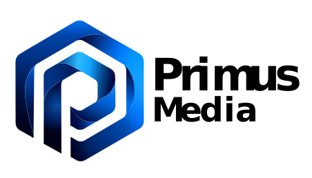
"Before Primus Media had a logo, it had a name – a foundational identity that needed a visual voice. Explore the design story behind the creation of our brand logo, translating core values and vision into a distinct visual symbol."
Transformed brand perception with a minimalist, high-impact aesthetic optimized for modern digital touchpoints.
Before Primus Media had a logo, it had a name – and a name like that doesn’t leave much room for error. Primusisn’t a word you can hide behind. It’s a promise. So the mark that would sit beside it couldn’t just look good, it had to earn the right to stand next to a word that means “first.”
This is the story of how that mark came to be. Not a straight line from idea to icon, but two concepts that looked right on paper and fell apart on screen, a breakthrough that arrived only after both of them were scrapped, and a lot of hours spent nudging a gradient by a few degrees until it finally felt alive instead of just correct.
If you’ve ever sat with a blank canvas knowing exactly what your brand meansbut not yet what it looks like, you already know the feeling this post is built around.
WHAT THE NAME MEANS
Primus. Media. Online.
Every logo worth remembering starts as a sentence before it becomes a shape. Here’s the sentence: Primusis Latin for “first” – not first in line, but first in class. The best, the biggest, the standard everyone else gets measured against. Media is the craft itself – the actual work being done. And .online isn’t a leftover domain suffix, it’s a claim: everything this company touches lives and breathes in the digital world, no exceptions.
Put together, that’s not a soft brief. It’s a mark that has to look like authority without looking heavy, feel digital without leaning on tired tech clichés and stay modern enough that it won’t feel dated the moment a trend shifts. Slick. Minimal. Unmistakably first. That was the bar – before a single pencil line got drawn.
Attempt 1
The Roman Pillar
The first instinct came straight from the name itself. Primus is Latin, so why not go straight to the source – a Roman pillar, something unmistakably digital resting on top of it like a modern pedestal. Old-world authority holding up new-world technology. On paper, it was almost too obvious not to try.
And for a moment, it made sense. Rome built things that lasted two thousand years – what better metaphor for “first” and “built to last”? But the moment the sketches left the page and became real mockups, the metaphor turned into a liability. Every version came out heavier than intended. Instead of authority, it read as age. Instead of digital, it read as a museum plaque. A company built on speed, iteration, and modern digital marketing was starting to look like a monument to something that stood still.
The pillar didn’t fail because the idea was wrong – it failed because the feeling was wrong. And in logo design, feeling wins every time facts try to argue with it.
Attempt 2
The play button and the satellites
Concept two swung hard in the opposite direction: a play button at the center, thin lines orbiting around it like satellites circling earth – a visual metaphor for content radiating outward, data becoming signal, signal becoming reach. On concept boards, it looked kinetic. Alive. Exactly the kind of “always-on digital media” energy the brand needed.
Built out, it told a different story. The orbiting lines created visual noise instead of visual rhythm – busy where it needed to be confident. It strained the eye instead of guiding it. Worse, it revealed a problem no concept sketch ever shows you: it didn’t scale. Shrink it to a favicon and the satellites disappeared into mush. Drop it on a dark background and the whole composition lost its center of gravity. A logo that only works at one size, on one background, isn’t a logo – it’s a poster. Back to the sketchpad.
What happened next
Structure first, meaning second
The breakthrough didn’t arrive as a new idea. It arrived as a new process. Instead of starting with a metaphor and forcing a shape around it, the approach flipped: start with structure, let meaning follow.
That meant grid-first. A disciplined, geometric foundation — the kind of scaffolding that guarantees a mark holds up whether it’s four pixels wide on a favicon tab or forty feet wide on a trade-show banner. Inside that grid, one letter took the center and refused to share it: a bold, unmistakable P — Primus, present at a glance, no translation required.
Then came the part that separated this version from everything before it: color, shadow and gradient, layered to make the mark move without a single frame of animation. Folded ribbons of blue that catch light like water – never flat, never static, always mid-motion. That fluidity isn’t decoration. It’s the whole philosophy of the company rendered in a single letterform: nothing here stands still. Everything gets better, one iteration at a time, exactly the way this mark went through two rejected concepts before it earned its place.
Getting the type right
Modern, not serif. Deliberate, not default.
A mark is only half the story – the wordmark next to it has to sound like it belongs in the same sentence. Serif was the first thing ruled out. Elegant, sure, but elegant in the wrong direction – the kind of typeface that reads like a magazine masthead or a legal firm, not a company built entirely around digital-first thinking.
Standard sans-serif was the safer temptation, and safe was exactly the problem. A default typeface says “this could be any company.” The type needed to carry the same energy as the icon beside it – confident, contemporary, unmistakably tech-forward – so the wordmark wouldn’t just sit next to the mark, it would move with it.
The result
Why it fits
Strip away the process and what’s left is a mark that carries the entire brief inside a single letter. Primus sits dead center, impossible to miss. The gradient and the fluid ribboning stand in for the company’s core belief – that “good” is a starting point, never a finish line. And the typography looks forward on purpose, because a company built on staying ahead can’t afford a wordmark that looks like it’s looking back.
Two concepts had to die for this one to exist. That’s not a footnote – that’s the whole point. The best mark rarely shows up first. It shows up last, after everything that looked good on paper has been tested against the real thing and found wanting.
Want a mark like this for your brand?
No templates, no stock icons, no “good enough.” Just a mark built the same way this one was – tested, rejected, rebuilt, until it actually fits. Tell us what you’re building.
Share on FacebookShare on X (Twitter)Share on PinterestShare on WhatsappShare on LinkedinCopy LinkLink is Copied!
Expert insights, delivered!
Stay informed with the latest updates and exclusive resources for high-growth teams. Reinforces professional authority and the "Trusted by teams" badge.